Music and colour are similar in the uncanniest of ways. At a fundamental level, both hit us in a powerful, memorable and emotional sense. This connection is overlooked by most, but a shift in perspective will make marrying music to your brand easier, relatable and very creative!
Can you see colour when you hear certain sounds? No? Then you probably aren't a synesthete. Don't feel bad, you would fall into the 92.8% of individuals who are just regular old humans. What I am referring to is synesthesia. Simply put, it's a neurological phenomenon. It's a phenomenon in which stimulation of one sensory pathway leads to an involuntary experience of another sensory pathway.
There are many forms of synesthesia, but one of the most common forms is ‘Chromesthesia', the ability to see sound as colour. The visualizations are called photisms and are often described as oscillating fireworks that change in hue and direction with sound. Everyday sounds can be a trigger, but synesthetes with an aptitude for musi typically have perfect pitch and the photisms aid in identifying keys or notes.
I find one of the most interesting correlations between music and colour to be that both follow a spectrum. It has been documented that synesthetes and non-synesthetes alike draw the comparison from low musical notes to dark colours (negative) and high notes to bright colours (positive).
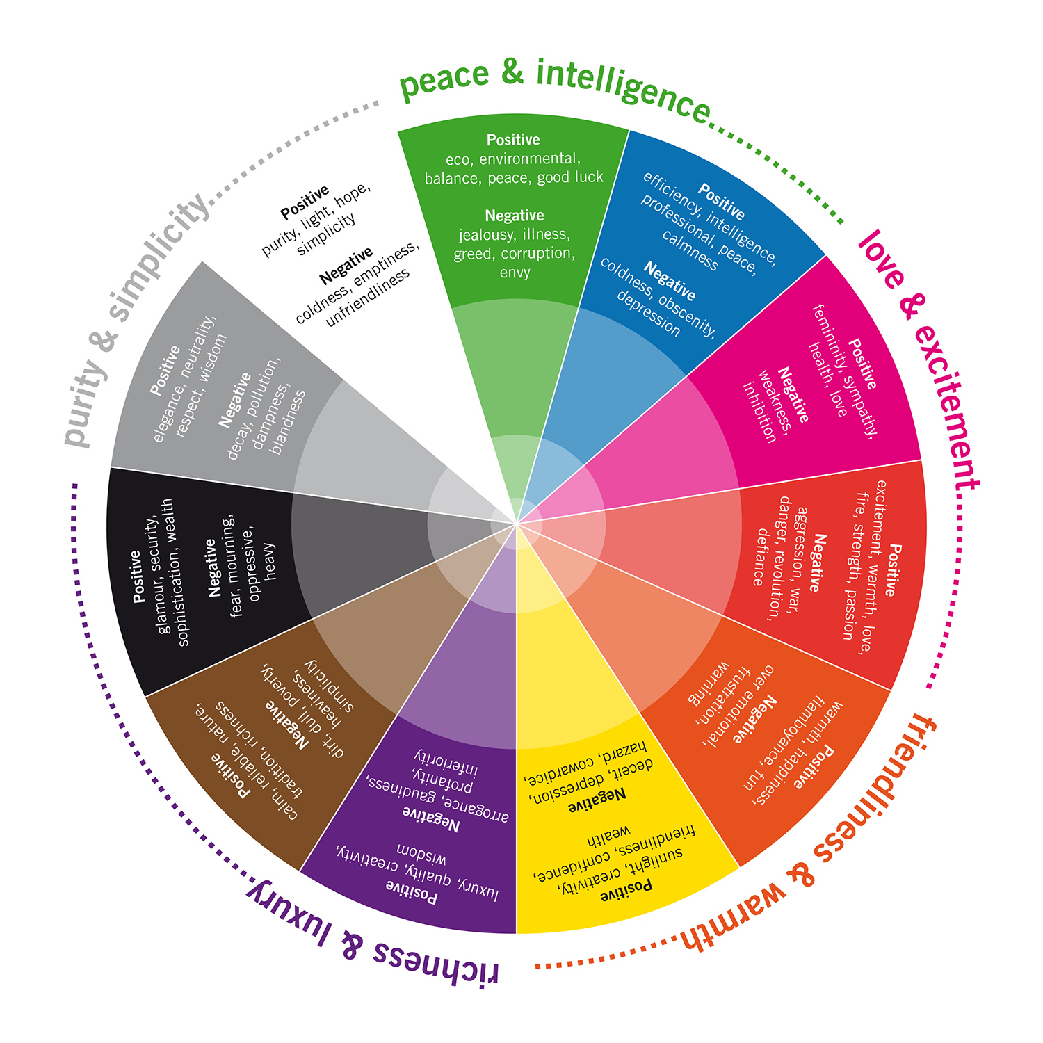
Check out the colour wheel below. This can be a great reference for assessing the colours in your message.
Source: http://www.toucandesign.co.uk/blog/colour-why-is-colour-choice-so-important-in-design
Music & Colour | 5 Reasons Why It’s Important
1. Music & colour have consumer-targeting abilities
There are no wrong colours! But, some are better than others depending on your age. Okay, colour psychology is not scientifically sound; albeit it has still been proven that specific colours will elicit a positive response with your target audience. Here’s a general breakdown of what I mean:
- Babies: High contrast visuals
- Pre-adolescent Children: Brighter primary and secondary colours.
- Teenagers: Open to experimentation with complex colours.
- Young adults: Similar to teens. Defined colour choices around the age of 25.
- Adults: Less open to experimenting with colour. Preference to more subdued colour.
- Mature: Calming colours of blue, green, pink and purple. Higher preference to muted colours.
We all know this is true with music as well. Most of us often remark on today’s music not being as good as it once was, right? The unfortunate reality is that we’re getting older…*gasp*…the once vibrant exciting colours/sounds we liked as a teen are not the one we prefer as an adult. Find out what your demographic loves to listen to. This is where your music search begins.
2. Music & colour set a mood to the message. Choose music purposefully as you would a colour scheme.
Avoid defaulting to personal preference when searching for music. Like colour, it's about what the music is conveying and how it relates to your video. Mood is key. Be sure to choose music that supports the message you want to convey in your video. The ability to articulate how music matches to colour is very helpful. Use the colour wheel above as a reference. When music searching, think about how the music supports your colour scheme and/or colour brand.
Here's an example:
Black = Power, Authority, Glamour
Listen to the music in this ad for the iPhone 7. How do you hear the music in relation to the colour black and its associated mood? Do you think this works to what black is representing? or is the music contrasting in this example? Leave a comment and let me know what you think!
3. Music & colour indicate product characteristics
After realizing, the mood and tone of your video you may want your music to say some important things about your product. We naturally associate a colour to qualitative characteristics. For example:
• Red = Strength
• Yellow = Friendliness
• Blue = Professional
Subconsciously we hear music the same way. Through genre, arrangement and instrumentation we can get all of these characteristics from music. Here are three practical examples of what I mean:
Red (Strength) Music: Ford
Yellow (Friendliness) Music: Cheerios
Blue (Professional) Music: PayPal
4. Music & colour draw attention and give a sense of direction.
Here’s an advert that Bedtracks did for Punkle and Circus Maximus: Jet.com - Kumail Nanjiani Explains How The New Shopping Club Works
I love this example. The music and colour in the video are working together to hold the attention of the viewer while directing attention to the products and savings throughout the video. The creativity in the music exemplifies the colour purple and drives the direction as the video progresses. Attention is held by the use of bright vivid colours. Take note of the purple shirt and hoodie that Kumail wears. These are perfect examples of colour matching to a business brand.
5. Music & colour subtly impacts decision-making and grow recognition for your brand.
The music in this example creates a strong connection to the message of the advertisement. Using a lyrical song from an established band creates a level of recognition for the brand. The lyrics do a great job of making a distinct connection to the branded colour of Coca-cola. Red = love, passion, strength, revolution and warmth. What's really interesting about this advertisement is that they also utilize the negative side of red at the beginning of the video (aggression, defiance and danger).
"Show Me Love" by Hundred Waters
I hope this article has given you creative inspiration for finding the best possible music for your brand and message!


